Auction.com is the nation's leading online real estate marketplace focused exclusively on selling residential bank-owned properties and foreclosure properties. It was reaching the ten-year anniversary of auction.com; what better than celebrating with a company rebrand? It was about six years since any significant brand design changes were implemented.
The Situation
- Auction.com needed to target a broader audience to increase its user base.
- An outside design agency with marketing developed the new brand before the product team was pulled into the redesign project.
- Our current style guide had limitations, was challenging to utilize, and was not uniformly incorporated into our products.
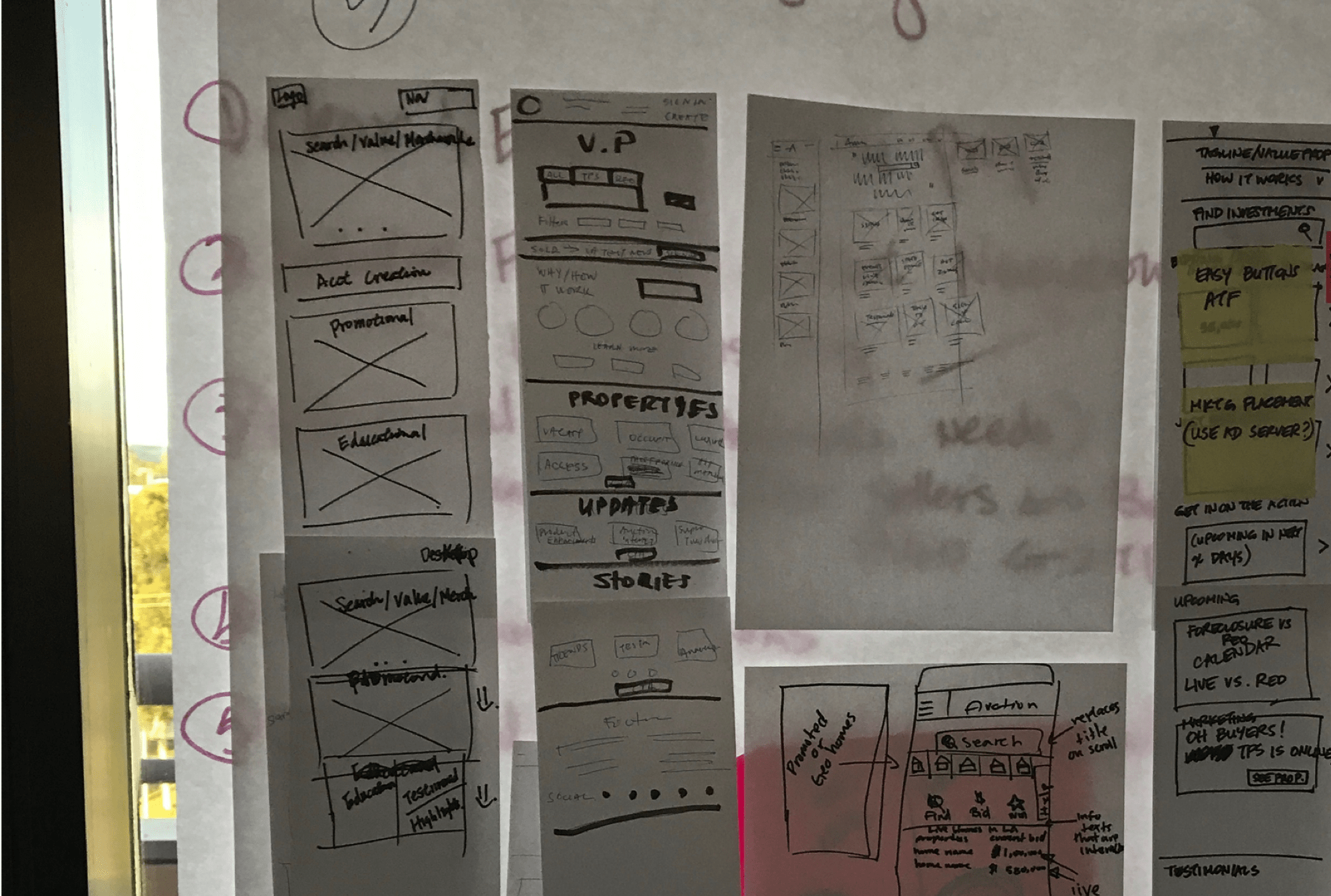
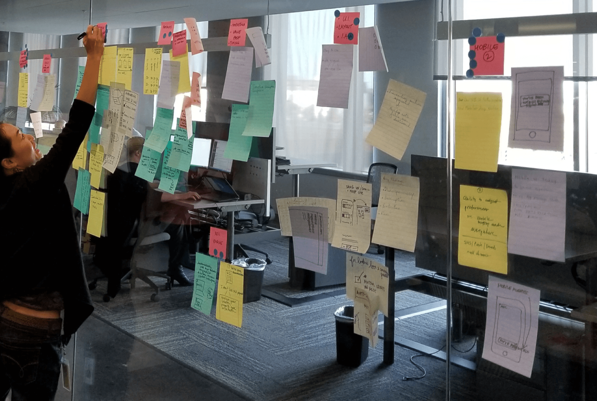
The Kickoff
To initiate this project, the product team conducted a design workshop with the marketing team. Subsequently, the plan was established:
- Competitive Analysis
- Feature Brainstorming
- Feature Poll
- User Testing
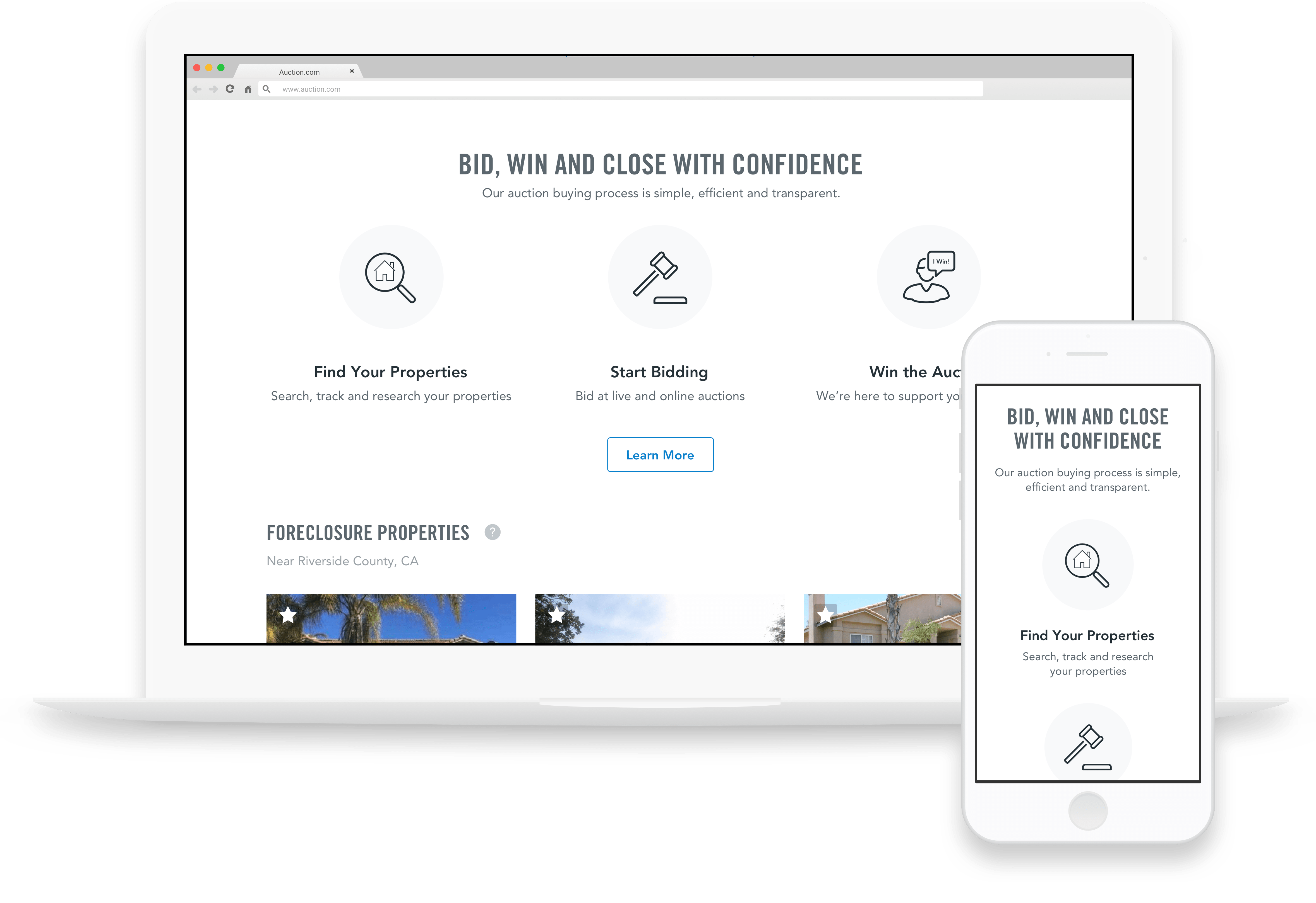
Who were we building the homepage for?
Project Hypothesis
For those unfamiliar with Auction.com, it may not be immediately clear what our site is all about. This lack of clarity can be a barrier to engaging with us. However, by providing informative and compelling content, we can establish trust with first-time visitors and motivate them to delve deeper into what Auction.com has to offer.
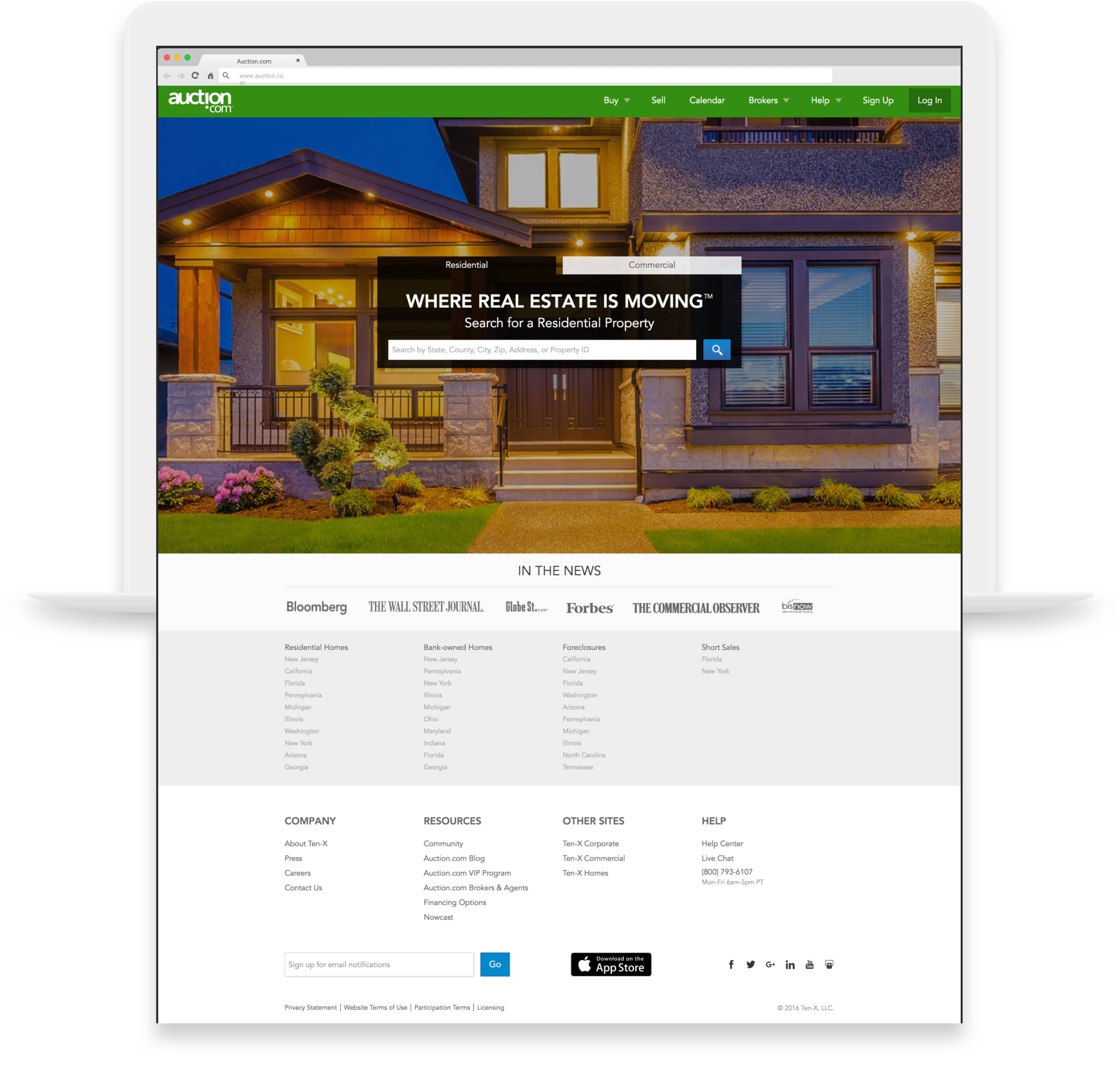
The Homepage from before.
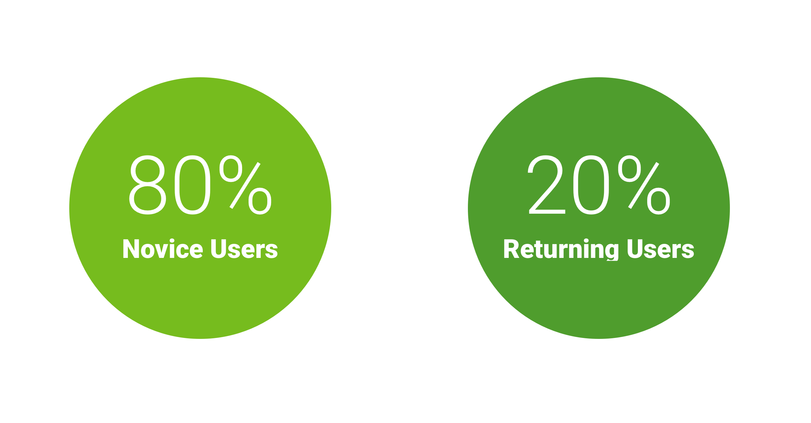
The Winner: Search Optimized
80% of the user testing felt more positive towards the searched optimized homepage.

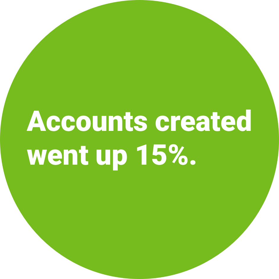
Homepage Wins

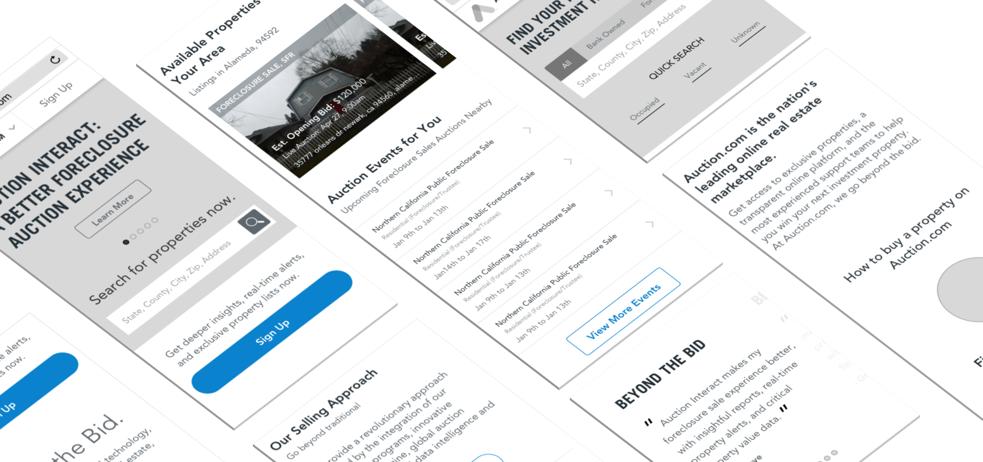
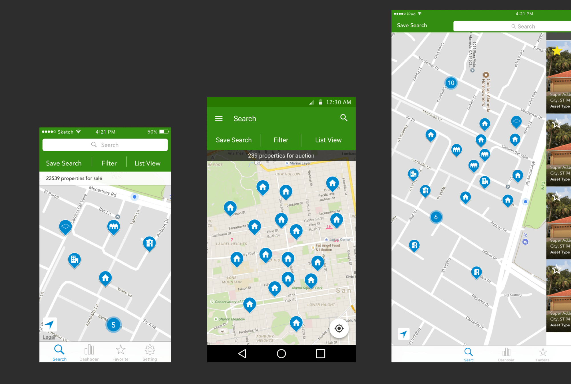
Native Mobile Apps
The Problem
- Inconsistent Verbiage
- Inconsistent User Experience
- Inconsistent Visual Design
What we did:
We have made updates to the style-sheets for both iOS and Android to ensure consistent colors, components, and type treatment. We have also begun creating a timeline for updating the tone and voice nomenclature. Additionally, our developers have started updating the codebase.
The end product.
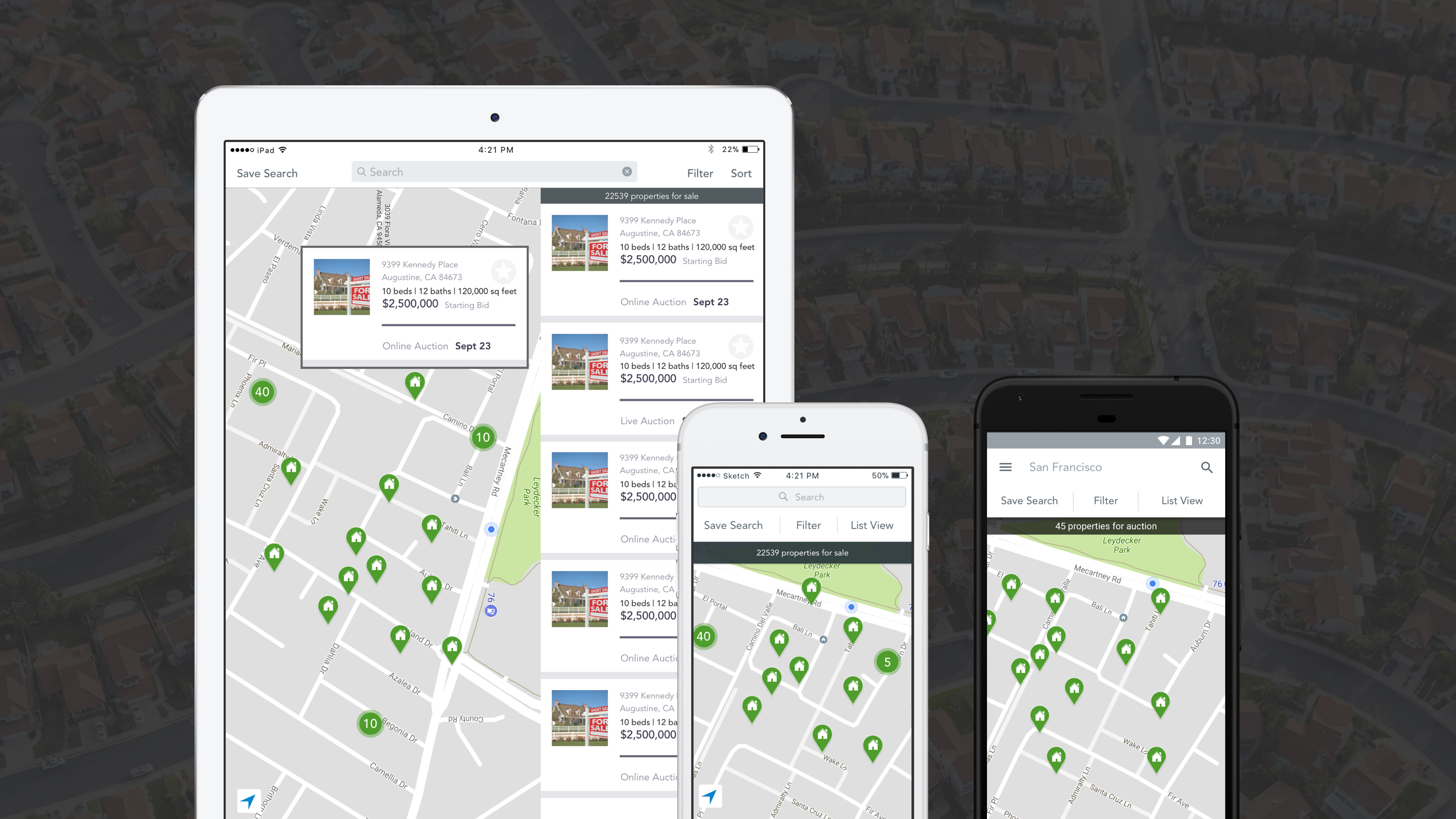
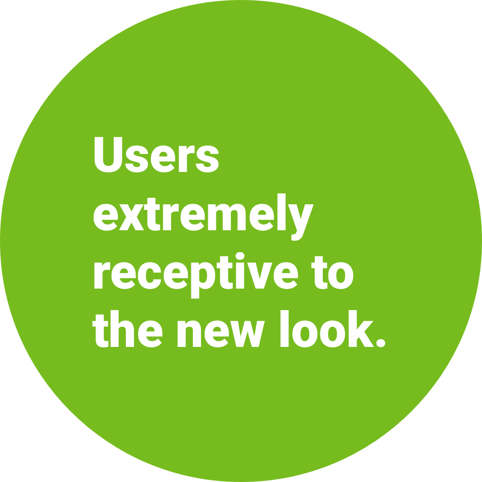
Mobile Wins:
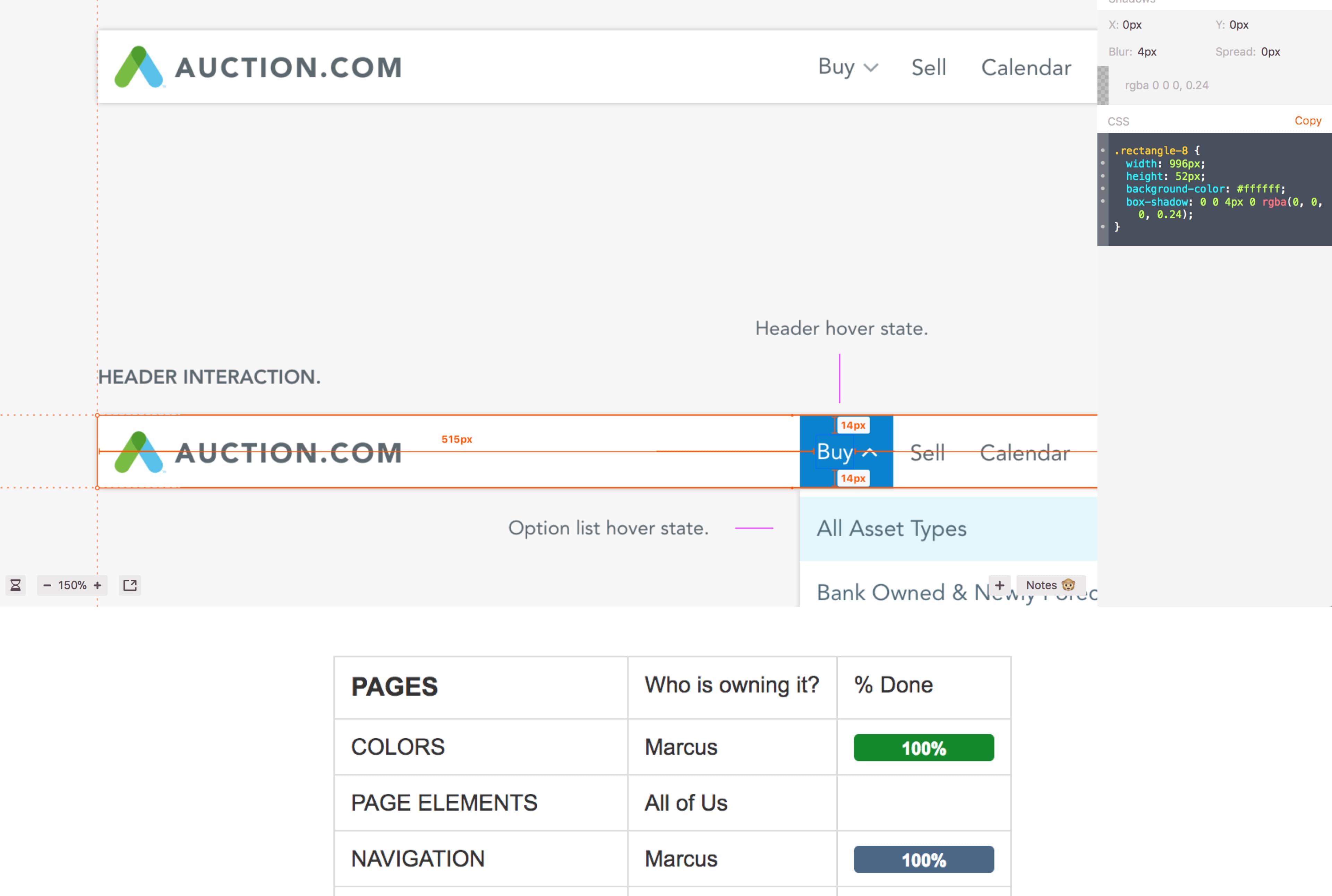
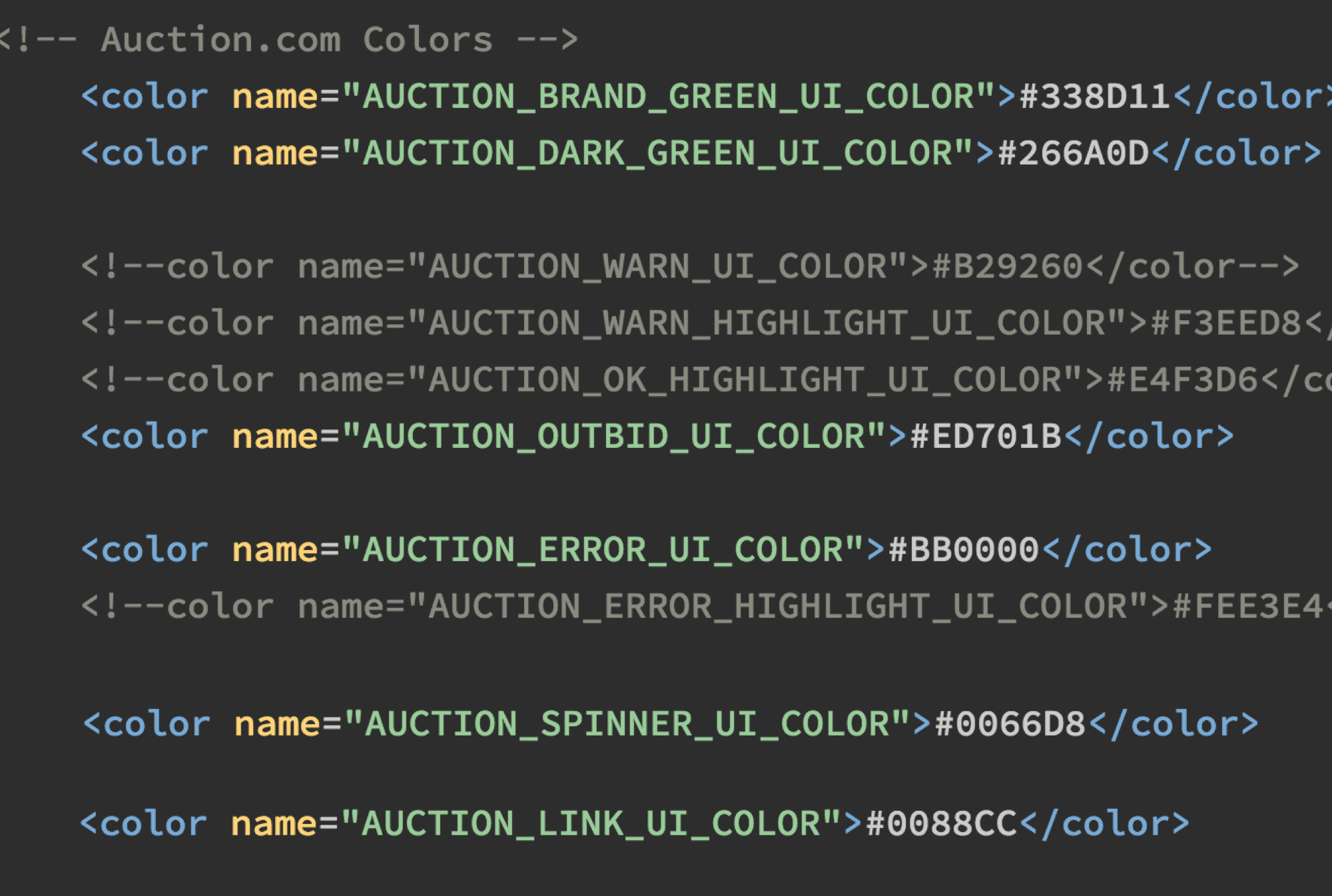
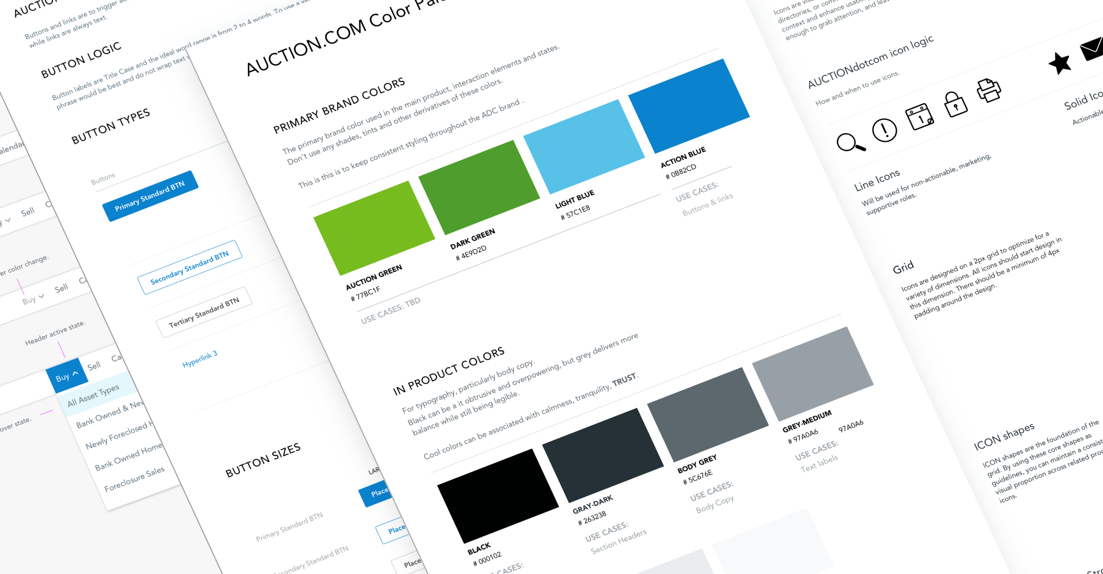
The Style Guide
The heart of all our products was the style guide. Our style guide needed a complete revamp of the visual product components and functionality.
Who would benefit from this?
- Current and future designers
- Our developers
- Day to day users
Divide and Conquer
Breaking all the components among the designers for weekly sync-ups to quickly update the style guide and developer toolkit.