
AUCTION.COM TPS Page
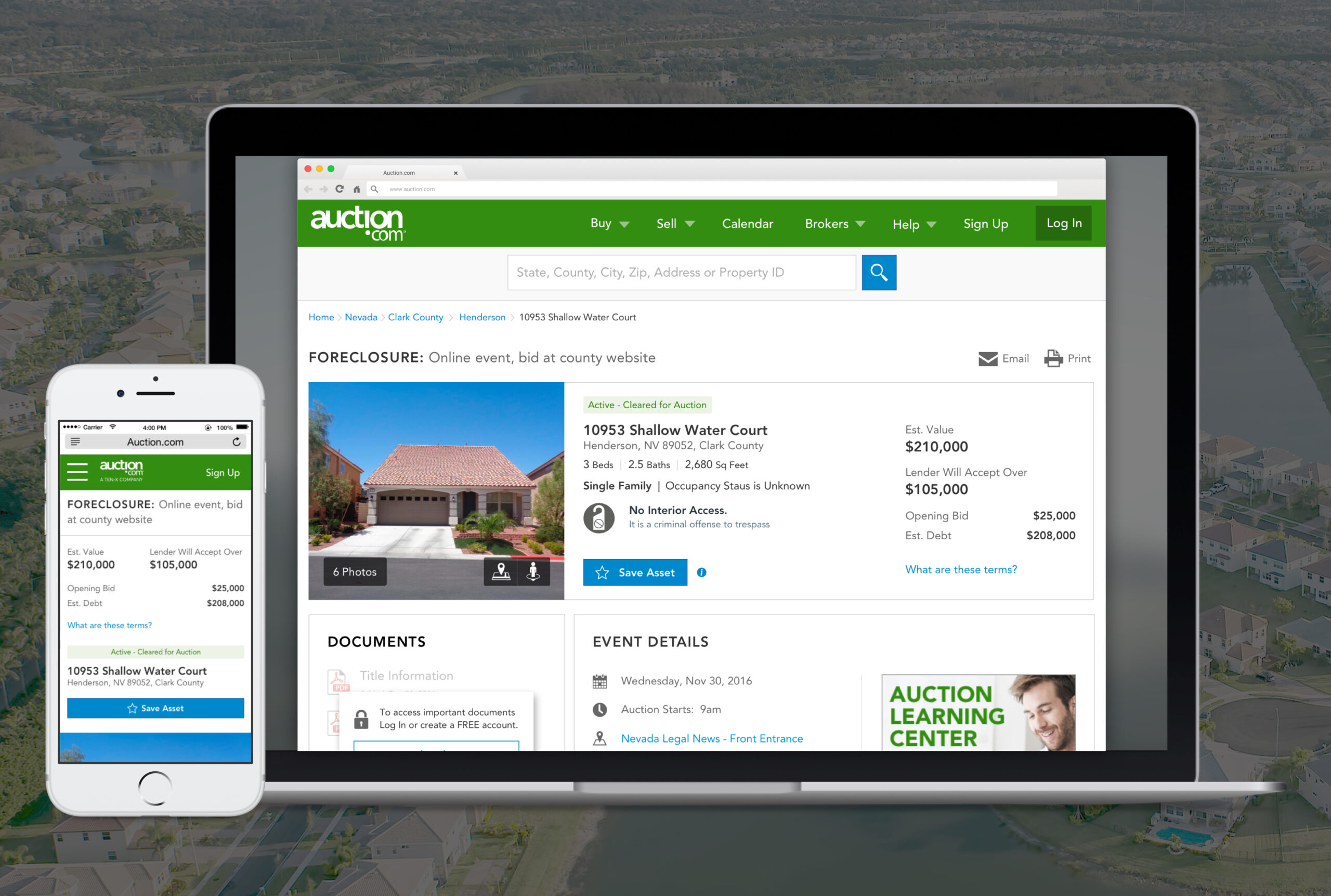
Led the redesign of Auction.com’s Third-Party Sales (TPS) flow — restructuring the property details page and step-based form to improve clarity, validation, and seller confidence during a high-value transaction.
TL;DR / Outcomes
Auction.com’s TPS flow was creating friction during a high-value transaction process. I led the redesign of the page structure and form experience, partnering with Legal, Operations, and Engineering to improve clarity, reduce errors, and help users complete the process with more confidence.
- Problem: Users faced friction and uncertainty in the TPS flow.
- Solution: Progressive, step-based form structure with clearer validation and status.
My Role & Scope
- Led the TPS workflow redesign while partnering with Legal, Operations, and Engineering for compliance, policy, and implementation readiness.
Context
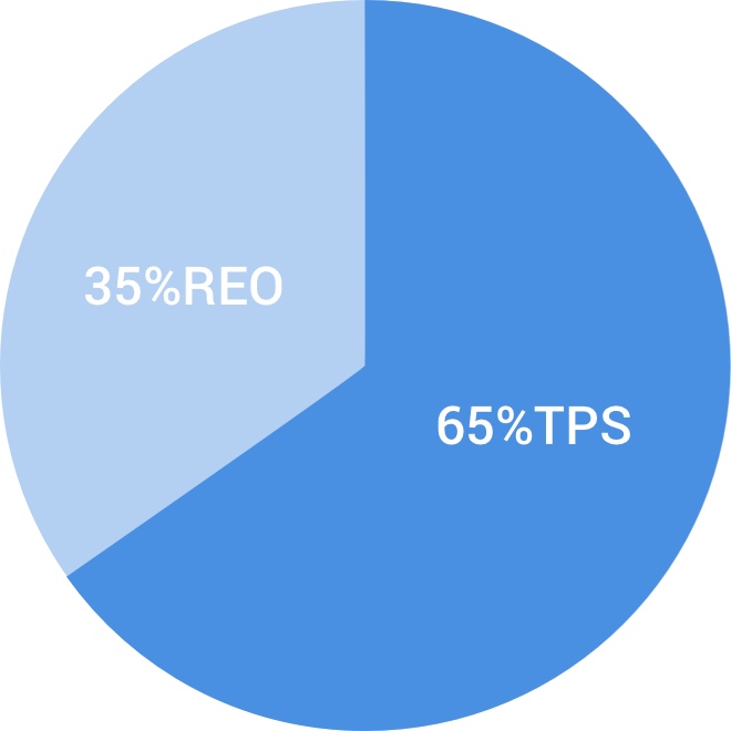
Third-Party Sales (TPS) represented 65% of Auction.com’s business — yet the existing experience did not give sellers enough reason to stay in the platform through a high-value transaction.
- The product team needed to demonstrate clear value to internal stakeholders and partner banks.
- Sellers faced a dense, unclear flow at the point where properties moved toward sale.
- Improving TPS was both a user experience problem and a business credibility problem.
Hypothesis & Approach
We hypothesized that a clearer TPS experience would increase seller engagement, improve revenue per property, and make listings easier to move through the sales process.
As lead designer, I partnered with engineering, project management, Legal, Operations, and business stakeholders to validate the direction through sit-in customer interviews and a design sprint before refining the property details page and step-based form.
Design Sprint
The sprint focused on restructuring the TPS property details page and identifying where sellers needed more guidance during the transaction.
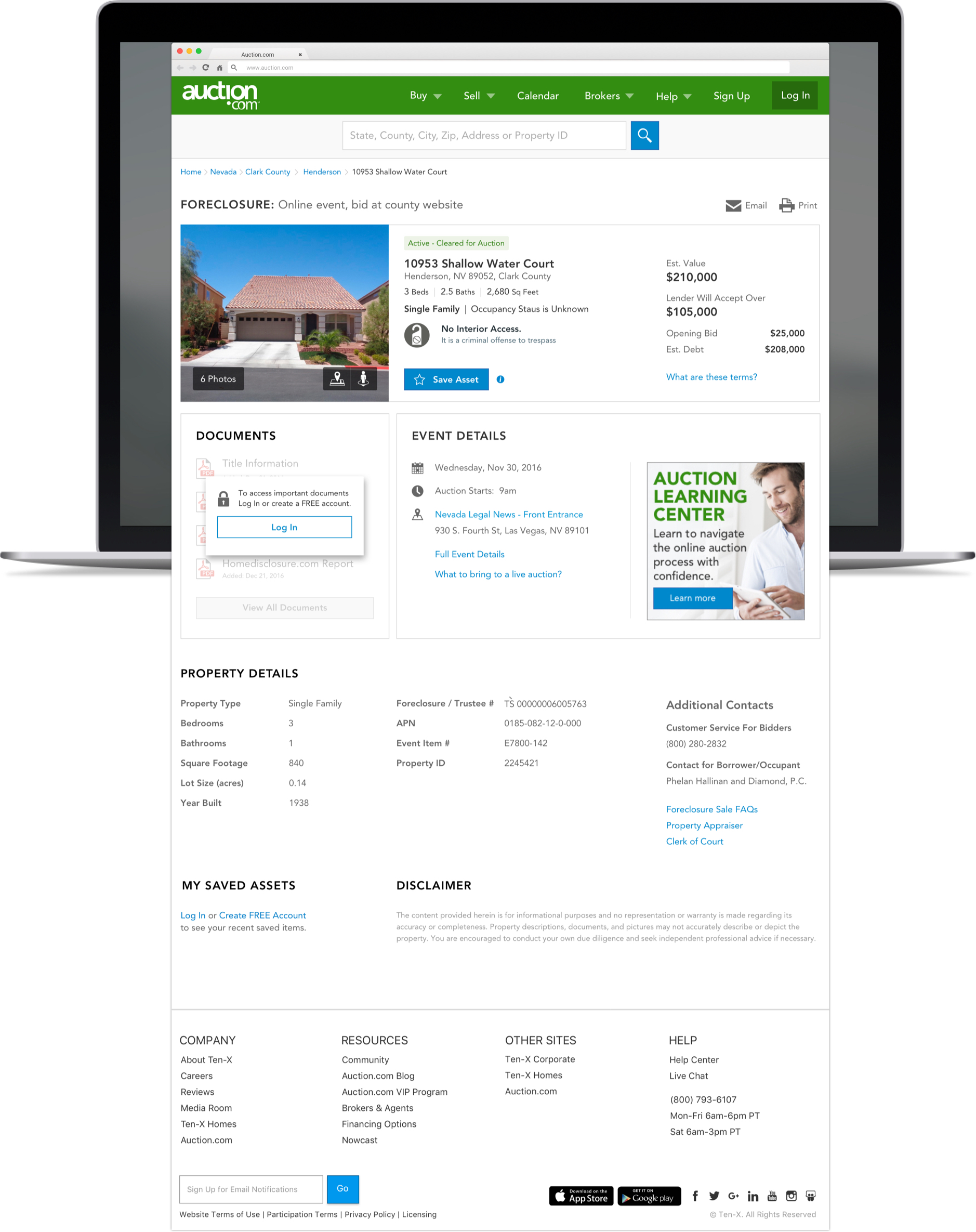
- A clearer page structure separating primary property information from supporting details
- Status change notifications so sellers could see where they stood in the process
- An initial valuation calculation concept to help sellers reason about pricing

User Testing
I partnered with our researcher on moderated sessions focused on property valuation — how sellers understood guidance, interpreted status, and decided on next steps.
Testing compared prototype directions for valuation presentation and helped narrow which patterns reduced uncertainty without adding unnecessary complexity.

Information Hierarchy
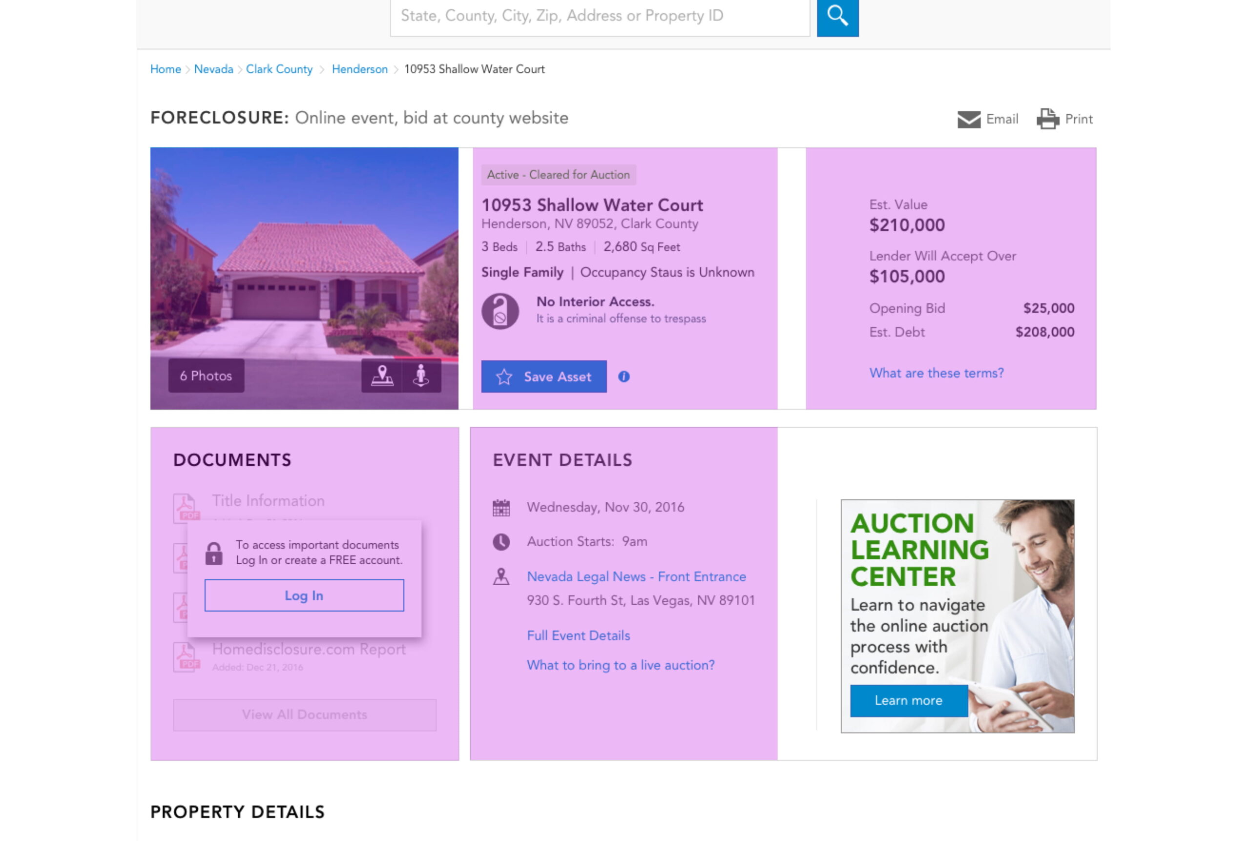
The final page structure prioritized what sellers needed to act on first, then surfaced supporting details without competing for attention.
Primary information
- Property photo
- Property address
- Property valuation
Secondary information
- Documents
- Event details
Key Learnings
Testing showed that users needed stronger guidance around valuation, status, and next steps. The final direction emphasized progressive disclosure, clearer hierarchy, and validation at the moment users needed it.
- Simpler, step-based flows outperformed concepts that prioritized visual polish over task clarity.
- Compliance and policy requirements from Legal and Operations had to be designed into the flow — not added as exceptions after the UI was complete.
Before Redesign
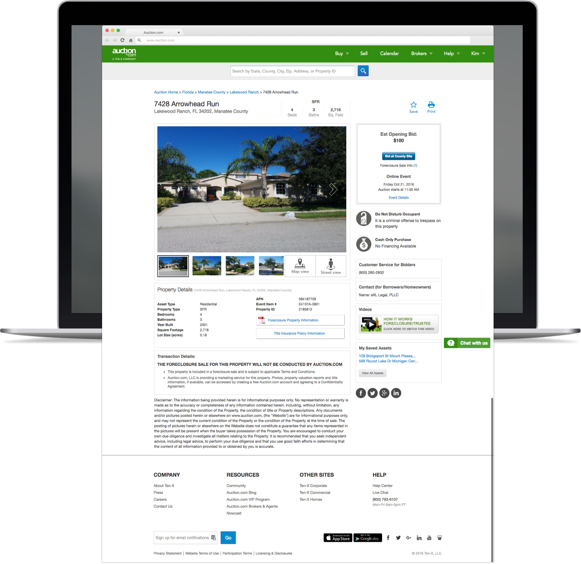
After Redesign
What I'd Do Next
- Extend save/resume telemetry to personalize reminders for in-progress sellers.
- Partner with customer support on a proactive help center flow embedded in confirmation.
Credits
- Legal, Operations, Engineering, and QA partners ensuring compliance and reliable launch.