
Case Study — MOVOTO Mobile Platform: My primary mandate was to elevate Movoto's mobile search and discovery products.
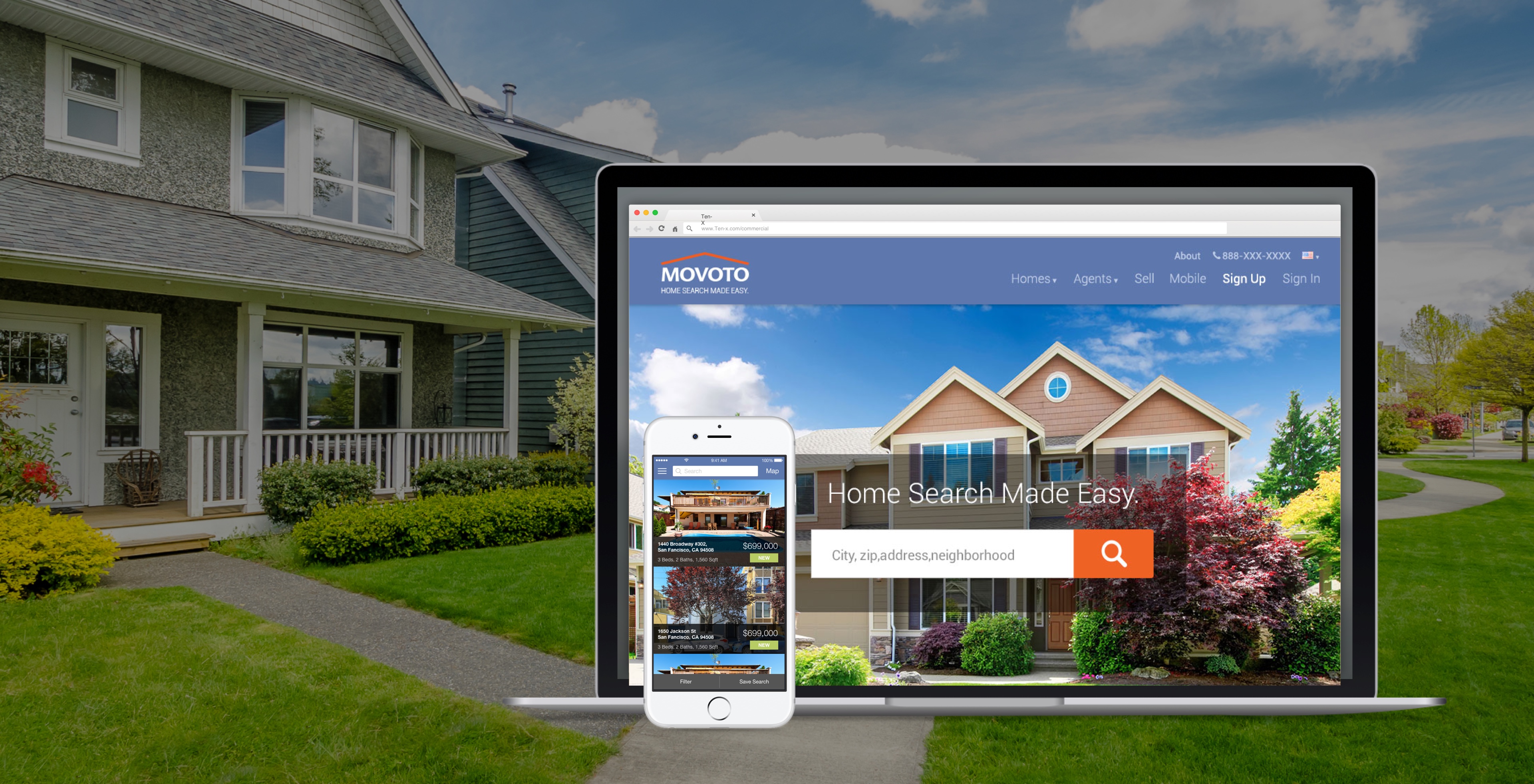
Reimagining Movoto’s digital experience to feel like a conversation with a trusted agent—across marketing, web, and native apps.
TL;DR / Outcomes
- My primary mandate was to elevate Movoto's mobile search and discovery products.
- We streamlined filter access, clarified listing states, and brought neighborhood insights forward so decisions could happen on the go.
- Usability testing revealed that buyers needed a relatable narrative about each property, not just feature checklists.
Context
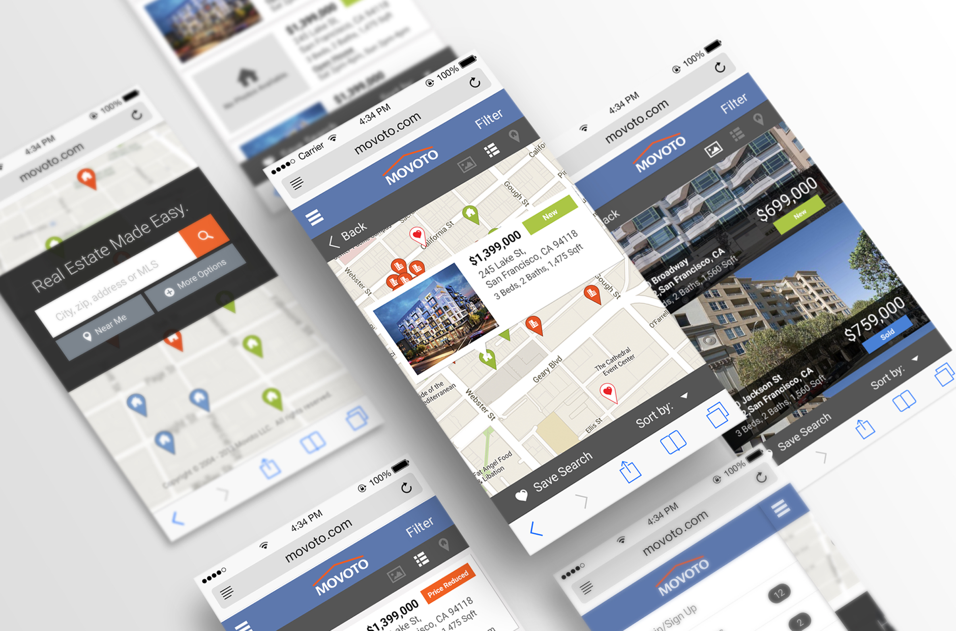
My primary mandate was to elevate Movoto's mobile search and discovery products. As the lead designer, I guided the UI toolkit and direction for both mobile web and native apps, crafting a mobile-first journey that feels cohesive and genuinely delightful for buyers browsing on the go.
My Role & Scope
- Led cross-platform UI direction and UI toolkit delivery with product, engineering, and growth stakeholders.
The UI Tool Kit
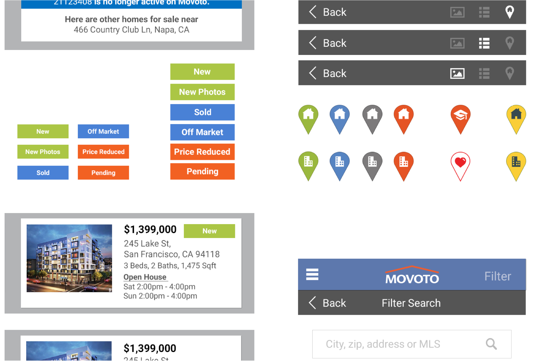
Rapid iteration meant developers needed a single source of truth. I produced redlines and Photoshop specs that bundled every badge, state, and component so front-end partners could ship updates without second-guessing styles or spacing.
Mobile Search
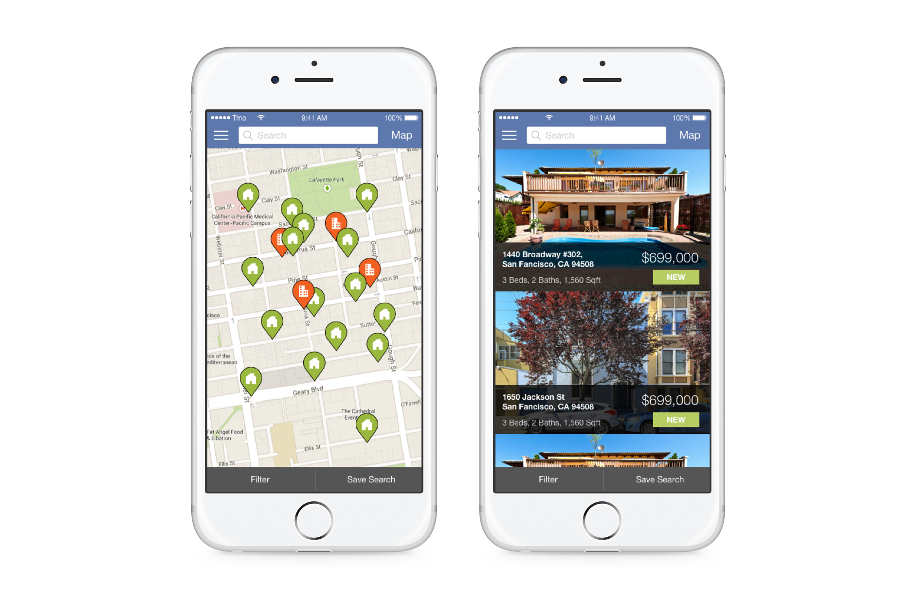
Translating the refreshed patterns to mobile ensured buyers could move from map to listings without friction. We streamlined filter access, clarified listing states, and brought neighborhood insights forward so decisions could happen on the go.
Property Pages That Earn Trust
Usability testing revealed that buyers needed a relatable narrative about each property, not just feature checklists. The new property detail page balances storytelling with structured data—bringing agent notes, commute times, and school insights above the fold while keeping compliance data accessible.
Quick-read highlights
A new hero module answers “Why this home?” in the first scroll.
Smart comparison drawer
Users can queue favorites and compare essentials without losing their place.

What I'd Do Next
- Capture in-product analytics on comparison usage to tune mobile merchandising.
- Extend storytelling modules to agent tools for co-branded follow-up experiences.
Credits
- Product, engineering, and marketing partners across Movoto.