
Auction.com Product Rebrand
Led the product-side integration of Auction.com’s rebrand across web and mobile, including shared components, typography, color, and implementation guidance.
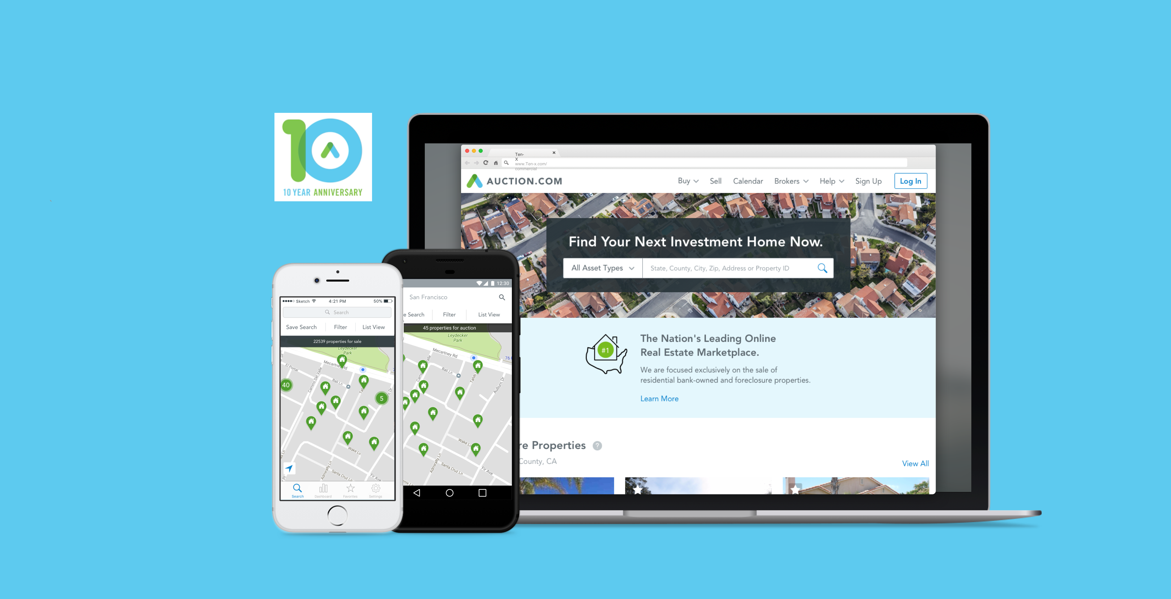
TL;DR / Design Work
- Defined information hierarchy for homepage, search, property detail, and account surfaces
- Documented typography, color, and hierarchy rules
- Created shared tokens, components, and implementation guidance
Context
Auction.com needed a more consistent and trustworthy product experience across web and mobile. In a high-stakes real estate marketplace, visual inconsistency can reduce confidence and make complex transaction flows feel riskier. The rebrand was an opportunity to improve visual consistency, product clarity, and design-to-development alignment across the platform.
- User trust: Buyers and sellers needed a cohesive experience as they moved from discovery into bidding and transaction workflows.
- Marketplace confidence: Inconsistent UI across surfaces made high-stakes decisions feel harder to trust.
- Product scalability: A shared design system and clearer patterns were needed so teams could ship consistent updates across web and mobile.
My Role & Scope
- Led product-side integration of the new brand system across web, native, and marketing touchpoints with design, engineering, and marketing partners.
Problem & Constraints
- Web and mobile had drifted apart, so the same marketplace task could feel different depending on where users started.
- An external agency delivered the new brand; product design had to translate it into patterns that worked for complex transaction flows, not just marketing pages.
- The existing design system was difficult to use, slowing consistent rollout and engineering handoff.
Product Design System
The rebrand became a product system, not just a visual update. The goal was to help teams ship consistent experiences faster while reducing one-off UI decisions.
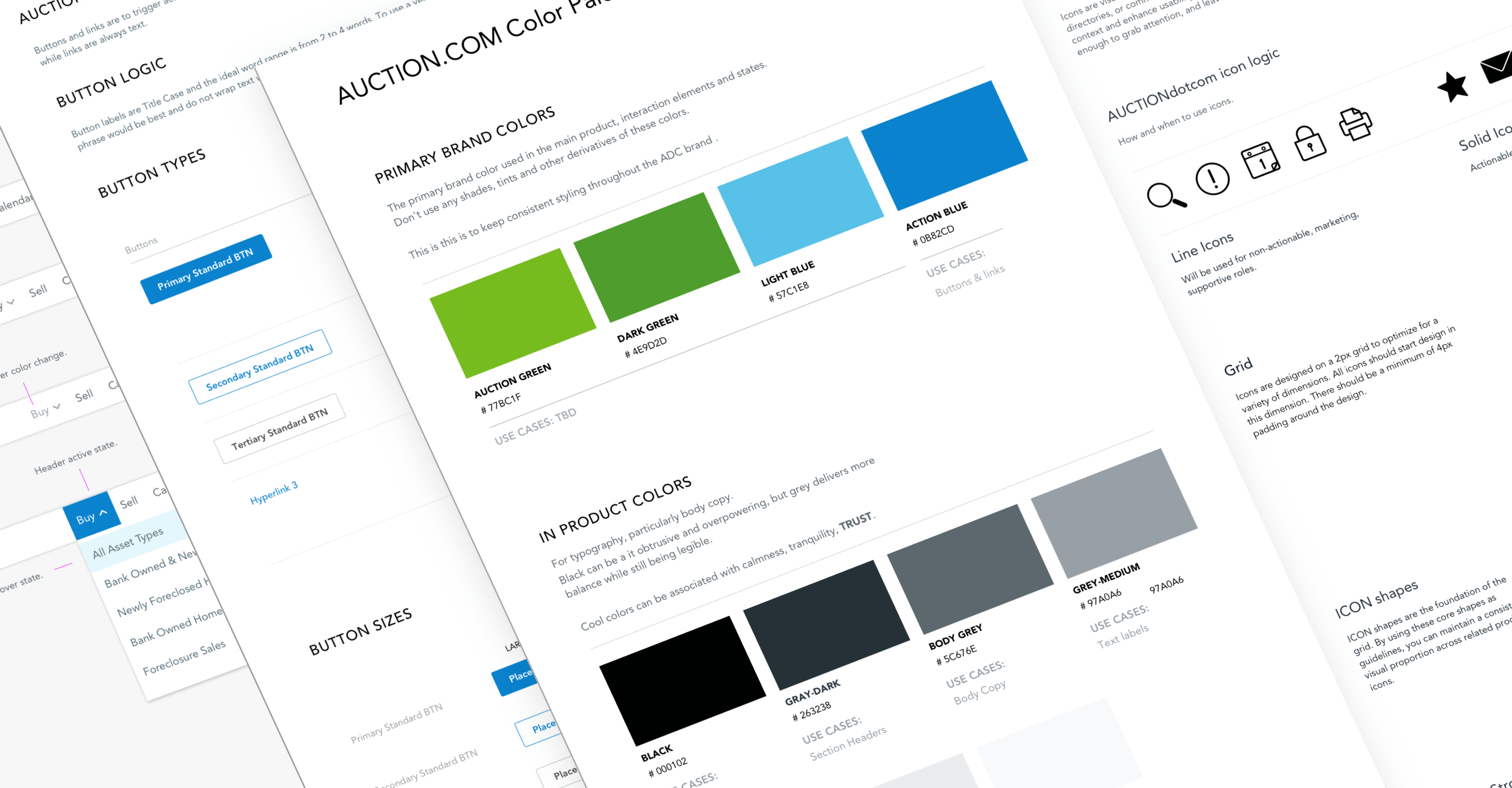
We translated the new brand into a reusable product foundation — documented patterns, shared components, and clear rules for when to extend the system versus align to it.
UI components
Documented buttons, forms, navigation, cards, and status patterns so teams could assemble transaction flows from shared building blocks instead of recreating UI per feature.
Page patterns
Defined layouts for homepage, search, property detail, and account surfaces so high-traffic journeys felt consistent and new pages had a credible starting scaffold.
Typography and hierarchy rules
Established a type scale, heading order, and content-density rules aligned to WCAG contrast requirements — supporting scanability in data-heavy marketplace screens.
Mobile behavior
Specified responsive breakpoints, touch targets, and native adaptations so web and mobile did not drift. Platform-specific patterns were documented where marketplace tasks required different interaction models.
Developer handoff guidance
Paired design specs with implementation notes, token definitions, and component ownership so engineering could adopt updates in smaller, reviewable batches.
Governance for consistent usage
Set contribution rules, review cadence, and criteria for adding versus extending components.
Operating Model
A system only works if teams can maintain it. We split component ownership across the design squad and met weekly to review progress, resolve overlaps, and keep the developer toolkit in sync.
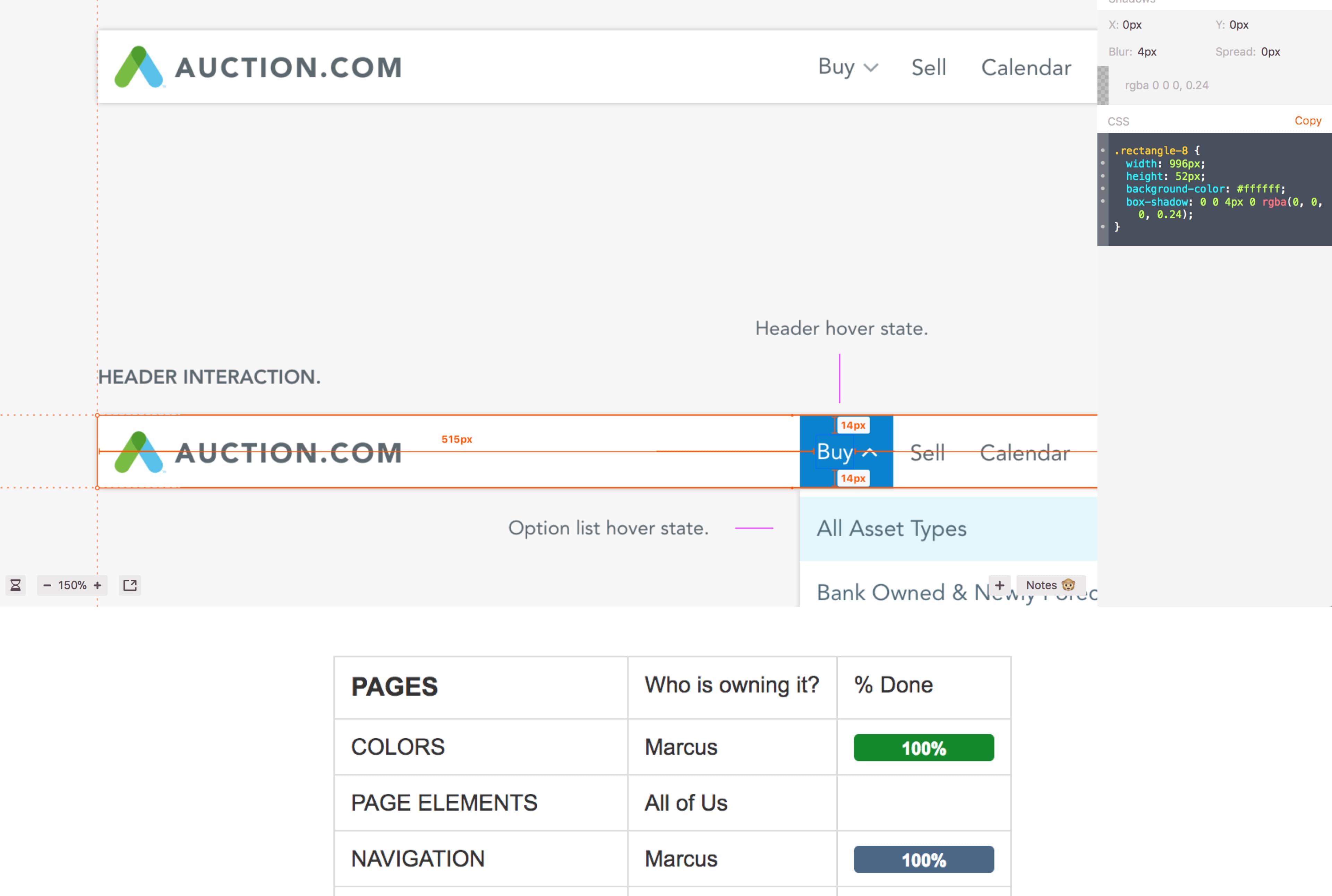
What changed for teams
- Design: A single source of truth for product UI replaced scattered files and one-off mocks.
- Engineering: Batched handoffs with named component owners.
- Product: The web style guide became the living reference for rollout.
The Kickoff
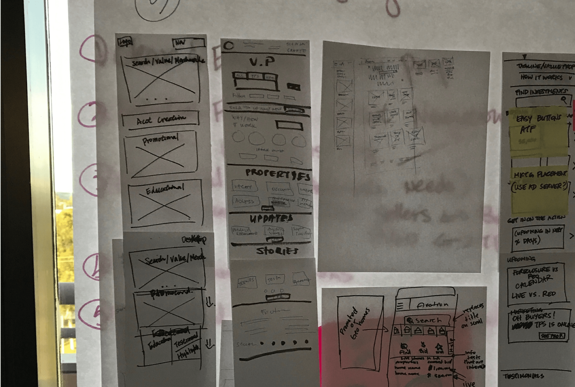
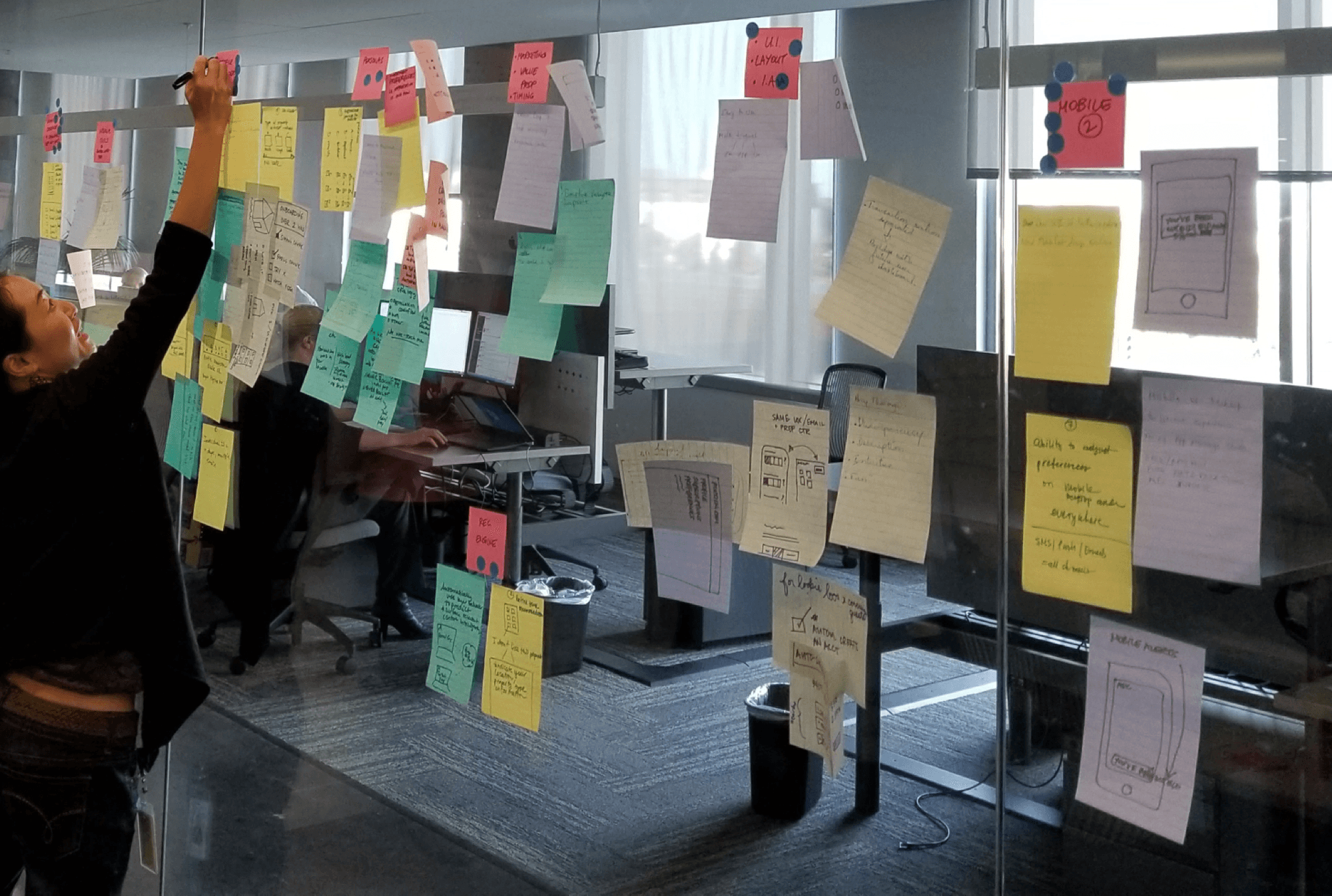
To initiate this project, the product team conducted a design workshop with the marketing team.
- Competitive Analysis
- Feature Brainstorming
- Feature Poll
- User Testing
Project Hypothesis
By aligning the new marketing-led brand with product design, we believed we could improve discoverability for novice buyers while preserving efficiency for experienced investors—ultimately increasing homepage engagement and qualified lead conversions.
- Novice buyers quickly understand key value propositions and next steps.
- Returning users retain fast access to familiar tools and saved properties.
- We aimed to shorten design-to-dev turnaround time with unified styling and components.
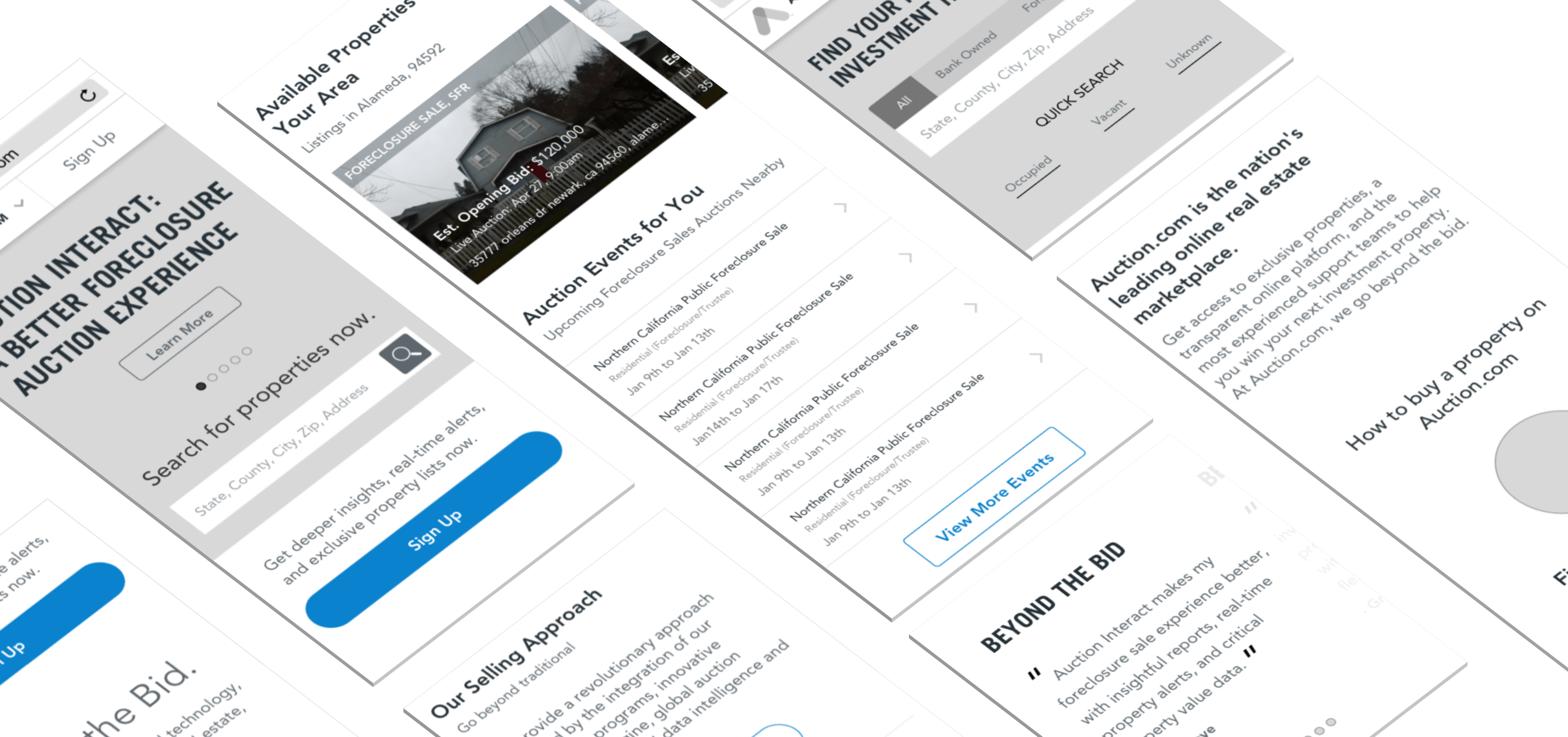
The Homepage from before.
The legacy homepage presented rich imagery but buried key information and actions, making it harder for new visitors to understand how to get started.
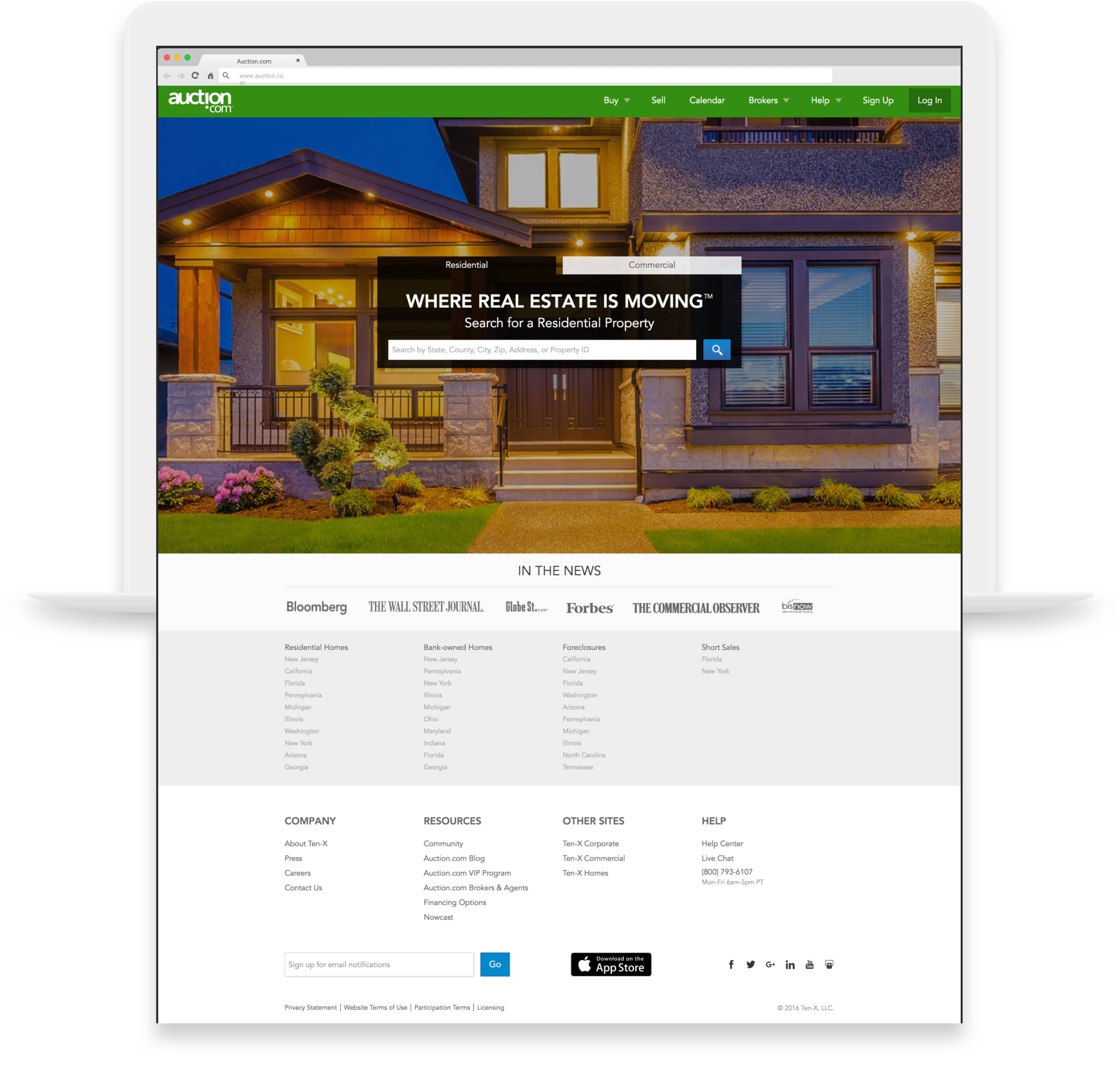
Search-First Homepage
The final homepage led with property search and included the marketplace value propositions.

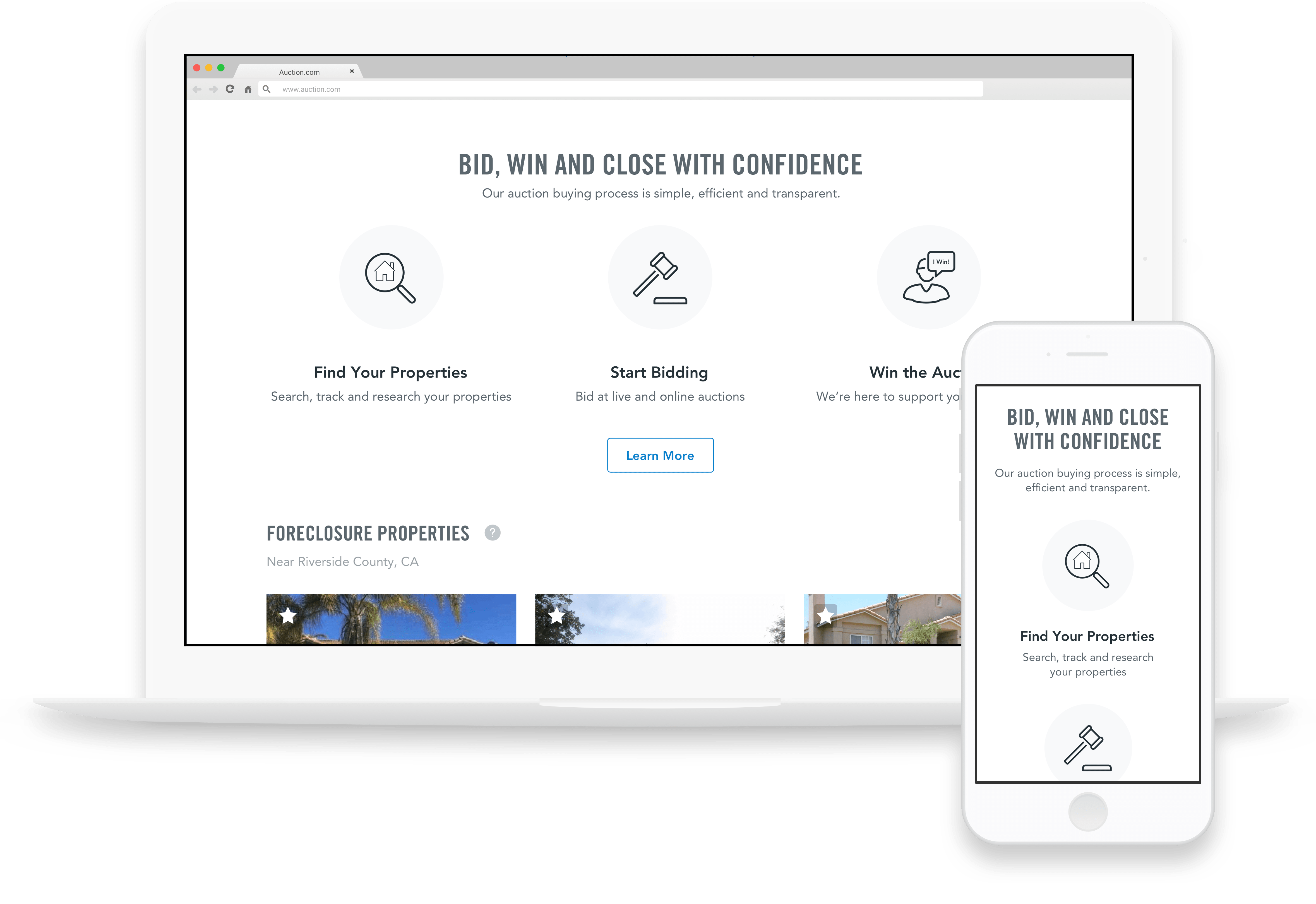
Native Mobile Apps
The Problem
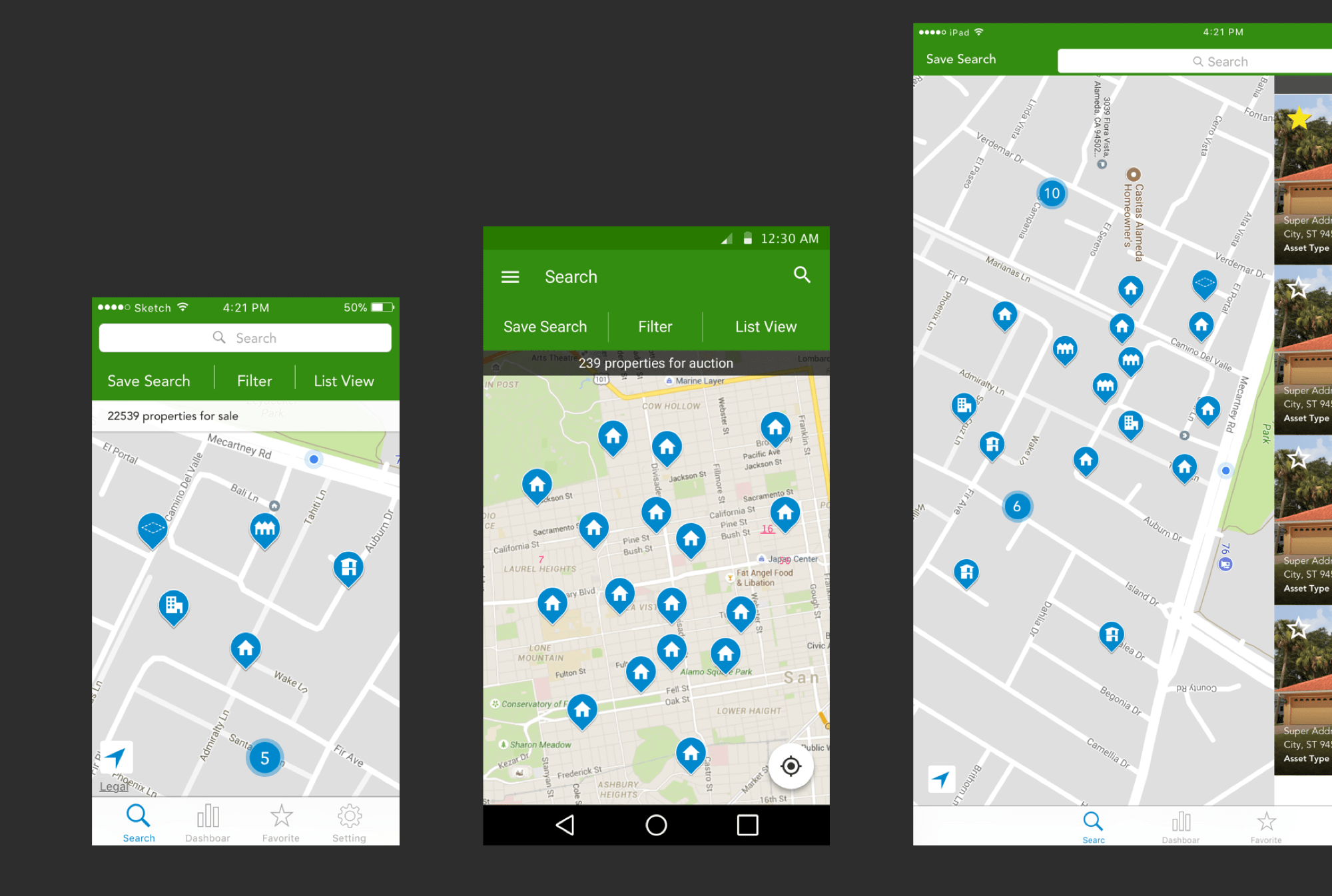
- Inconsistent language confused users moving between iOS and Android.
- Interaction patterns varied by platform, slowing down key tasks.
- Visual styles drifted from the updated brand system.
The Effort
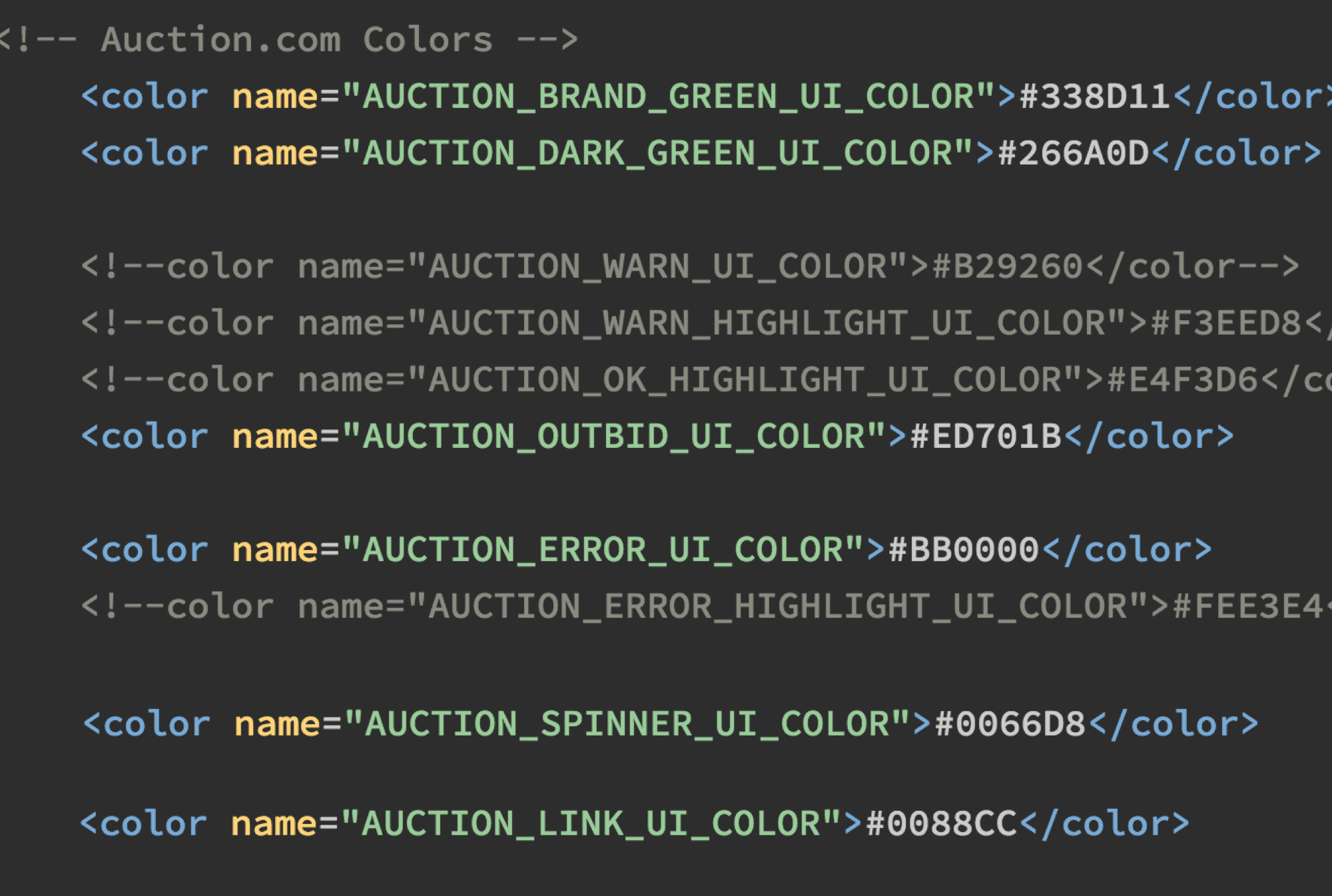
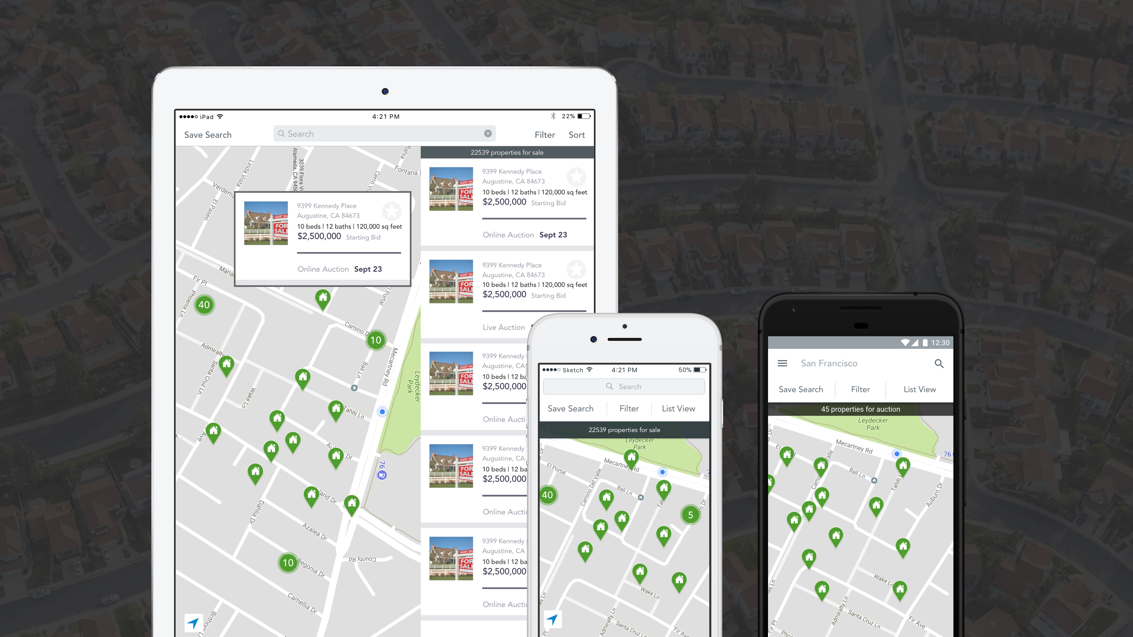
We updated the style sheets for iOS and Android to ensure consistent colors, components, and type treatment. We also began creating a timeline for updating the tone and voice nomenclature, and developers started refactoring the codebase to align with the new system.
The End Product
What I'd Do Next
- Extend the refreshed brand system into seller dashboards and transaction workflows.
- Partner with marketing to co-own an ongoing governance cadence for shared components.
Credits
- Product design, marketing, engineering, and content partners across Ten-X.